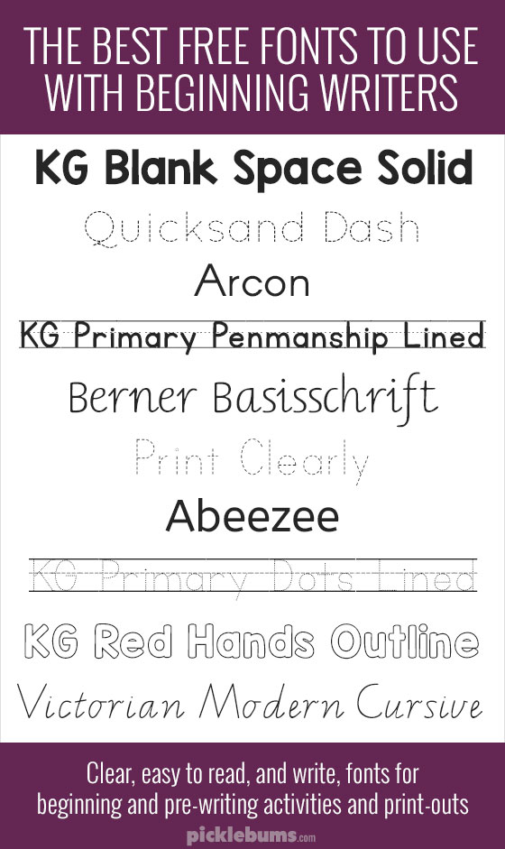
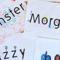
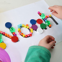
Over the years I’ve created and printed lots of things for my own kids and I’ve also created lots of free printables for preschoolers and beginning readers and writers. I am often asked which fonts are good to use with beginning writers, so today I’m going to share some of the best.
I am not an expert on teaching handwriting, and I know that kids will be exposed to a wide variety of fonts and writing, but I tend to stick to simple, clear, fonts, in a basic printed style when creating something for my kids and others.
I look for fonts without any fancy or irregular letters (I especially look at the a and g), and without any flourishes or extras. I also look for fonts with good spacing and height, and fonts that have both upper and lowercase letters.
It’s important to remember that many states and/or school districts will have a specific type of handwriting style that they teach their students, so if it’s important to you to start your child off with the same style, then check with the school first.
There are loads of great free fonts out there that are clear, and easy for beginners to read, write, and copy. Here are a few of my favourites.

Ten Free Fonts to use with Beginning Writers.
- KG Blank Space Solid – a good, strong, printed font, great for kids to write over or collage on to.
- Quicksand – a nice, clear, printed font that comes in a range of styles including bold and the dotted version shown above. (C)
- Arcon – a clean and simple font that is easy to read and great for story writing.(C)
- KG Primary Penmanship – this clear handwriting font comes in several styles including displaying on dotted third lines as shown above.
- Berner Basisschrift – this handwriting font comes in two styles – one printed and one pre-cursive with the little hooks on the letters, as shown above.
- Print Clearly – a clear, printed font that has solid and dotted options. (C)
- Abeezee – neat, easy to read printed letters. (C)
- KG Primary Dots – a dotted print in four styles – plain letters, and three different lined versions.
- KG Red Hands Outline – an outline font that is perfect for tracing over or colouring.
- Victorian Modern Cursive – this is the handwriting style my kids are taught in school – though the style of handwriting taught does vary from state to state here in Australia this is a clear pre-cusrive font.
Note – When I create my printables I only use commercial use fonts (I’ve marked these with a (C)) but for personal use at home any free font is fine.
Here are some ideas, activities, and free printables, featuring these fonts:


Great round up! When I get back in the classroom I will definitely put these to good use. :)
Following you on google + now!
Confused about #4
I want the penmanship lines to show up when I hit space, however they do not. Is there a font where I can type a word with penmanship lines, such as ‘kite’ and then make spaces so the penmanship lines still show up?
Both KG Primary Penmanship and primary dots fonts come with options for the lines to show up in the spaces, you just need to make sure you are choosing the right font.
I require dotted fonts on four lines rather than three. Can you help in this matter?
Any fonts with a starting star and/or combined with directional arrows?
Reduces the need for teachers assistance.
I don’t know of any good free ones that have a starting point and arrows, but you might find what you are looking for on Teachers Pay Teachers
Are these fonts free for use in commercial work as long as you are given credit? :)
You will need to check the terms of use for each individual font if you want to use them for commercial use. Different fonts can be used for different things with different requirements, so you need to check each one individually.
Thank you so much for sharing your font finds!
I require dotted fonts on four lines rather than three. Can you help in this matter?
I’m sorry I have not seen any fonts with four lines, dotted thirds is the standard for many curriculums which is why it is so common.